Degrees of Injustice: What Thermal Mapping Reveals About Heat, Poverty, and the Geography of Survival in American Cities
The City Is Not One Temperature
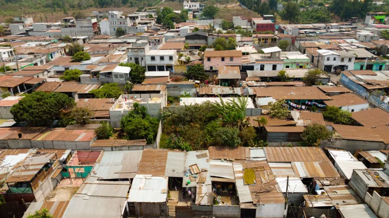
When a heat wave descends on a major American city, the experience is not uniform. In tree-lined residential districts where mature canopy coverage approaches 40 percent, afternoon temperatures may peak at a manageable 88 degrees Fahrenheit. Fewer than five miles away, in neighborhoods defined by cracked asphalt, aging industrial facilities, and a near-total absence of shade, surface temperatures measured by satellite can exceed 115 degrees on the same afternoon. That 27-degree differential is not meteorological coincidence. It is the thermal signature of decades of compounding disinvestment — and GIS mapping is now making it impossible to ignore.
Researchers at universities and conservation science centers across the country have spent the past decade assembling spatial datasets that, when overlaid with precision, tell an unambiguous story. Surface temperature rasters derived from Landsat 8 and ECOSTRESS satellite imagery, combined with parcel-level tree canopy assessments, impervious surface classifications, and census income data, reveal a pattern that holds with statistical consistency across Atlanta, Houston, Phoenix, Detroit, Baltimore, and dozens of other American cities: the hotter the neighborhood, the lower its median household income.
How Disinvestment Writes Itself in Heat
Understanding why this pattern exists requires tracing its spatial origins. The geographies of urban heat vulnerability were not formed randomly. They were shaped by a succession of policy decisions — some historical, some ongoing — that systematically concentrated environmental burdens in communities with the least political and economic power to resist them.
Redlining, the discriminatory mortgage practice formalized in the 1930s and not formally outlawed until 1968, is increasingly recognized as a foundational variable in urban heat mapping. Studies that have geocoded historical Home Owners' Loan Corporation risk maps and compared them against contemporary thermal data have found that neighborhoods once graded "hazardous" — a designation applied almost exclusively to communities of color — are today between 2.6 and 7 degrees Fahrenheit hotter on average than formerly "desirable" areas. The mechanism is direct: redlined neighborhoods received less mortgage capital, less municipal infrastructure investment, less tree planting, and more industrial zoning. The physical consequences of those decisions are still radiating heat.
GIS analysis makes this legacy legible. By joining historical zoning records with current land use classifications and thermal imagery, researchers can trace the spatial pathway from discriminatory policy to present-day heat exposure with a level of evidentiary specificity that narrative alone cannot achieve. Industrial corridors that were sited adjacent to low-income residential zones generate waste heat and replace permeable soil with heat-absorbing concrete. Decades of deferred municipal maintenance have left street tree inventories in these same neighborhoods severely depleted. The result is a landscape engineered, however inadvertently, for thermal accumulation.
Measuring What Was Always Felt
For the communities living inside these heat gradients, the data confirms a reality already known through daily experience — heat-related illness, disrupted sleep, elevated energy costs, and the particular vulnerability of elderly residents without access to air conditioning. What the spatial record adds is the capacity to quantify, compare, and ultimately hold institutions accountable.
The National Oceanic and Atmospheric Administration's Urban Heat Island Mapping Campaign, which has partnered with local volunteer networks in more than 60 American cities, has generated granular temperature datasets collected at street level during peak summer conditions. When these measurements are processed through GIS platforms and visualized as continuous thermal surfaces, they expose intra-urban temperature disparities at a resolution that satellite imagery alone cannot achieve. The resulting maps have been used in public health advocacy, municipal budget negotiations, and federal grant applications — translating scientific data into political leverage.
In Richmond, Virginia, a city with one of the most extensively documented urban heat island profiles in the country, researchers found that formerly redlined neighborhoods experienced heat index values high enough to pose serious health risks on more than twice as many days per summer as their wealthier counterparts. In Phoenix, spatial analysis of heat-related emergency medical service calls overlaid against neighborhood income and canopy cover data showed a concentration of incidents in a small number of census tracts characterized by low vegetation density and high proportions of elderly residents living alone. The geography of suffering, when mapped, is rarely random.
The Canopy Gap as a Conservation Problem
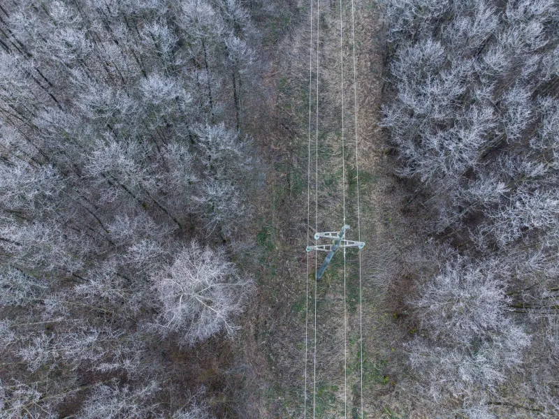
From a conservation science perspective, the urban tree canopy gap is among the most tractable and consequential environmental inequities that GIS is currently illuminating. Trees perform a suite of ecosystem services — evapotranspiration, shade provision, stormwater interception, carbon sequestration — that are directly relevant to urban heat mitigation. Their absence is not merely an aesthetic deficit; it is a measurable reduction in ecological function with direct public health consequences.
Spatial analysis of urban forest inventories across American cities consistently reveals a canopy coverage gap that tracks closely with income. A 2021 analysis drawing on high-resolution aerial imagery and parcel-level socioeconomic data across 37 major US cities found that the lowest-income quartile of urban census tracts had, on average, 30 to 40 percent less tree canopy than the highest-income quartile. In some cities, the disparity was far more pronounced. That gap represents an ecosystem services deficit that compounds with each successive heat event.
The encouraging development is that GIS modeling is now being used not only to document these gaps but to prioritize interventions with measurable projected impact. Spatial optimization tools can identify parcels where tree planting would produce the greatest surface temperature reduction per dollar invested, accounting for soil conditions, existing shade patterns, proximity to vulnerable populations, and long-term survivability projections under future climate scenarios. This moves urban greening from a general aspiration to a precision conservation strategy.
Interventions That the Data Shows Are Working
Several American cities have begun deploying spatially targeted heat mitigation programs guided by GIS analysis, and early monitoring data is beginning to validate the approach. In Los Angeles, the Cool Streets initiative used thermal mapping to identify priority corridors for cool pavement coating installation and targeted tree planting. Follow-up surface temperature measurements in treated areas recorded reductions of up to 10 degrees Fahrenheit during peak afternoon hours compared to untreated control blocks in similar land use contexts.
In Baltimore, the Parks and People Foundation has used canopy gap analysis to direct tree planting resources into the city's hottest, lowest-income neighborhoods, with post-planting monitoring integrated into the program's spatial database from the outset. In Philadelphia, green stormwater infrastructure — bioswales, green roofs, permeable paving — is being sited using multi-criteria GIS analysis that weights heat vulnerability alongside flood risk, producing installations that address multiple environmental justice concerns simultaneously.
These programs are still young, and long-term monitoring data remains limited. But the spatial frameworks being developed to guide them represent a meaningful methodological advance: the shift from reactive documentation of environmental injustice to proactive, evidence-driven intervention.
A Map Is an Argument
The thermal maps emerging from urban heat island research are, in the most direct sense, arguments about responsibility. They demonstrate that the distribution of climate risk within American cities is not the outcome of neutral natural forces but the spatial product of decisions made by institutions — municipal governments, real estate markets, industrial developers, federal agencies — over the course of generations. That framing has consequences for how cities approach planning, how federal climate resilience funding is allocated, and how communities organize to demand equitable investment.
Geographic information science cannot by itself repair the structural conditions that produce heat inequality. But it can establish, with a precision that is difficult to dismiss, exactly where those conditions exist, how severe their effects are, and which interventions are most likely to reduce harm. In a policy environment where resources are contested and attention is scarce, that kind of spatial evidence is not a minor contribution. It is, increasingly, the foundation on which durable change is built.